Google G Logo Update: A Fresh Look After 10 Years
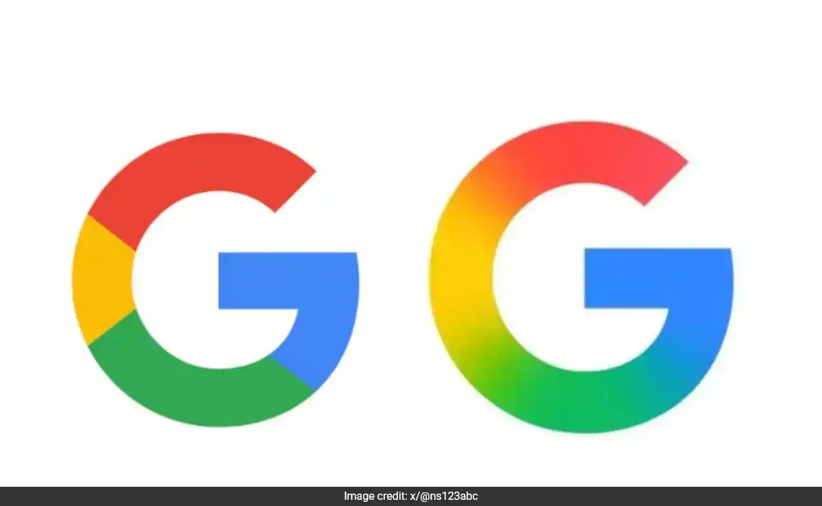
The Google G logo update has officially launched, marking the first major redesign of the tech giant’s iconic symbol in nearly a decade. This refreshed version of the Google G logo update introduces a smooth, gradient transition between Google’s four signature colors—red, yellow, green, and blue—replacing the older, segmented color scheme that users have grown familiar with since 2015.

The circular ‘G’ first appeared on September 1, 2015, during a broad visual rebranding that also introduced the now-familiar six-letter Google wordmark in a modern sans-serif font called Product Sans. Before that overhaul, Google’s logo featured a lowercase white ‘g’ on a solid blue background, reflecting a much earlier design philosophy.
What’s New in the Google G Logo Update?
The redesigned icon brings a more fluid and polished aesthetic, aligning with Google’s broader shift toward visual cohesion and modern UI principles. The gradient allows each color to subtly merge into the next—creating a more organic, eye-friendly look that reflects Google’s evolving design ethos and increasing integration of AI-driven design principles.
As of now, the new icon has already started appearing on the Google Search app for iOS. Meanwhile, Android users received the refreshed logo earlier this week via version 16.18 (beta) of the Google app.
What About the Main Wordmark and Other Google Products?
It’s worth noting that the six-letter “Google” logo introduced in 2015 remains unchanged. According to insights from 9to5Google, there’s currently no indication that the main wordmark or other product icons like Chrome, Drive, or Maps will immediately follow the gradient update. However, given that these apps also share the four-color palette, it’s plausible that they could adopt a similar design language in the future.
Bonus Update: Google Keep Gets Rich Text Formatting
In related developments, Google has also enhanced its Keep note-taking app on the web. A newly introduced “Rich Text Formatting” feature adds a toolbar to the bottom-left corner of the text editor. This feature allows users to apply formatting styles such as Headings (H1, H2), bold, italic, underline, and even clear any applied formatting—offering a cleaner, more structured note-taking experience.
A Visual Shift That Reflects Google’s Evolution
The decision to update the ‘G’ icon marks a symbolic shift in Google’s visual language. While the change may seem minor to casual users, it reflects the company’s ongoing effort to maintain a forward-looking, unified identity across platforms—especially as AI, mobile design, and intuitive interfaces become core to the user experience.
As Google continues refining its brand and products, updates like these are small but telling signs of larger transformations happening within the company.


This is really interesting, You’re a very skilled blogger. I’ve joined your feed and look forward to seeking more of your magnificent post. Also, I’ve shared your site in my social networks!
I like the efforts you have put in this, regards for all the great content.